Frutiger Aero
/FROO-tih-jer AIR-oh/noun
Frutiger Aero is a retrospective name for glossy, optimistic-looking design that blends digital technology with nature imagery.
- #internet aesthetics
- #design history
- #2000s design
- #visual nostalgia
Meaning
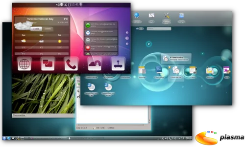
Online, Frutiger Aero labels a visual style associated with roughly the mid-2000s to early 2010s: shiny gradients, glass-like or translucent surfaces, rounded interface elements, bright blues and greens, and images of grass, water, bubbles, or fish. The style appeared in more than desktop interfaces, including products, advertisements, and interiors. The label is descriptive, not automatically praise or criticism; nostalgia or irony depends on the particular post.[1][3]
- 1. A retrospective design-aesthetic label for glossy, colorful visuals that combine technology with natural imagery.
- 2. In social posts, a way to identify or evoke that look, sometimes with nostalgia; the name alone does not show whether a particular use is affectionate, ironic, or simply descriptive.
Examples
“That old glassy menu is pure Frutiger Aero.”
“The wallpaper's bubbles and bright blue sky give it a Frutiger Aero feel.”
“I want a Frutiger Aero mood board: glossy buttons, grass, and water.”
Origin and spread
The style existed before it had the name now used online. CARI describes it as a corporate-tech aesthetic associated with approximately 2005–2013, with cues including glossy design, skeuomorphic interfaces, transparent materials, aurora imagery, bokeh, and macro photographs of grass. The name refers to Adrian Frutiger's typeface and Windows Aero. CARI's page credits Sofi Xian and Froyo Tam with coining the term; the Frutiger Aero Archive dates the coinage to 2017. A later account describes a public launch in a Facebook group in January 2018, with Xian proposing “Frutiger Colorful” and Tam adding “Aero.” These accounts document the naming and spread, but do not establish an absolute first occurrence. The style later resurfaced as an internet aesthetic; the framing of any particular post depends on its context.[2][3][4]
How to use it
Use Frutiger Aero when the visual cues fit, not as a synonym for every glossy interface. It is broader than Windows Aero or web-interface “gloss”: examples can include products, advertisements, and interiors. Y2K refers to a related but distinct earlier aesthetic, while Frutiger Metro is described as a transitional style, not a synonym. The label itself does not guarantee nostalgia, irony, or a judgment of quality.

A retrospective label
The style had no common name at the height of its influence, according to Wikipedia. Frutiger Aero is therefore a later label for a visual style, not necessarily the wording people used for it at the time.[3]
Not just desktop glass
The archive lists examples across game consoles, toys, architecture, and commercial spaces as well as interfaces. A nature-inspired glossy look can fit the label even when it is not a Windows screen.[2]
Nostalgia depends on the post
Wikipedia reports that some social posts framed the style as “the future we were promised but never delivered.” That is one documented nostalgic framing, not a meaning built into every use of the term.[3]
Questions people ask
Was Frutiger Aero the name people used during the 2000s?
Not generally, according to Wikipedia, which says the style had no common name at the height of its influence. The label was applied retrospectively to design from that period.[3]
What do the sources say about when the name emerged?
The Frutiger Aero Archive dates the coinage to 2017, while CARI credits Sofi Xian and Froyo Tam with coining the term without dating it. A later account describes a public launch in a Facebook group in January 2018; the earliest occurrence remains unestablished.[1][2][5]
How is Frutiger Aero different from Web 2.0 Gloss?
Web 2.0 Gloss refers especially to reflective, glossy web-interface elements. Frutiger Aero is the broader aesthetic label, used for a range of media and designs; the archive notes it could not establish that “Web 2.0 Gloss” was used contemporaneously.[2]
Sources
- 1. Consumer Aesthetics Research Institute — Frutiger AeroSupports: meaning, form.
- 2. Frutiger Aero Archive — HistorySupports: origin.
- 3. Wikipedia — Frutiger AeroSupports: meaning, origin.
- 4. Aksioma — An Archaeology of a Promised Future: How Frutiger Aero Was UncoveredSupports: origin.
- 5. Z△IK△ — From “Y2K” to “Frutiger Aero” — Who Defines Internet Aesthetics?Supports: earliest documented use.